 Fix My Truck
Website designs
One website, six designs
Each design below is the complete Fix My Truck website: every page works, every form sends. Only the look changes. Open any of them and browse as a customer would; the Design button at the bottom left of every page shows the same page in the other designs.
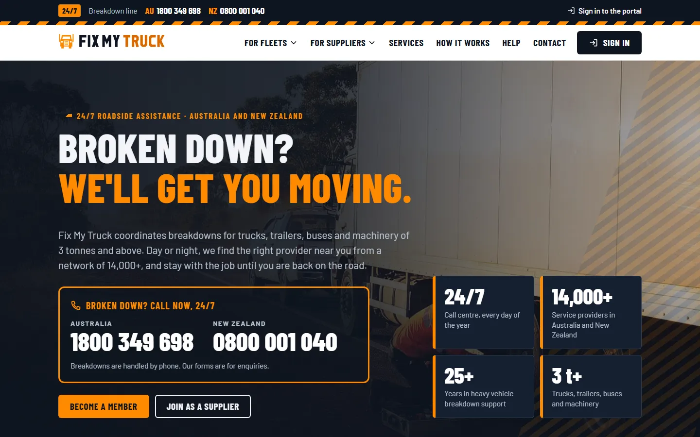
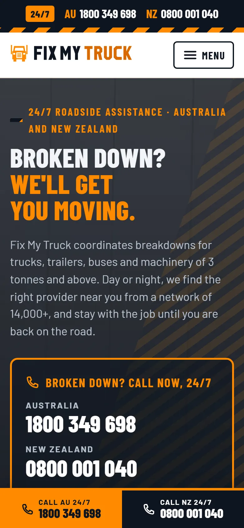
Design 01
Hi-vis industrial
Navy, hi-vis orange, hazard stripes
Confident and trade-focused: the colours of a hi-vis vest and hazard lights, condensed headings, phone numbers set large. Built for drivers and fleet managers who need help now.
- Tone
- Bold, practical, urgent
- Photography
- Daylight roadside work: a mechanic at a truck, a wheel change, the wheatbelt from above
- Best for
- Drivers and owner-operators who need help now; the trade
Straight to: Home · Membership · For fleets · For suppliers · Help centre · Contact
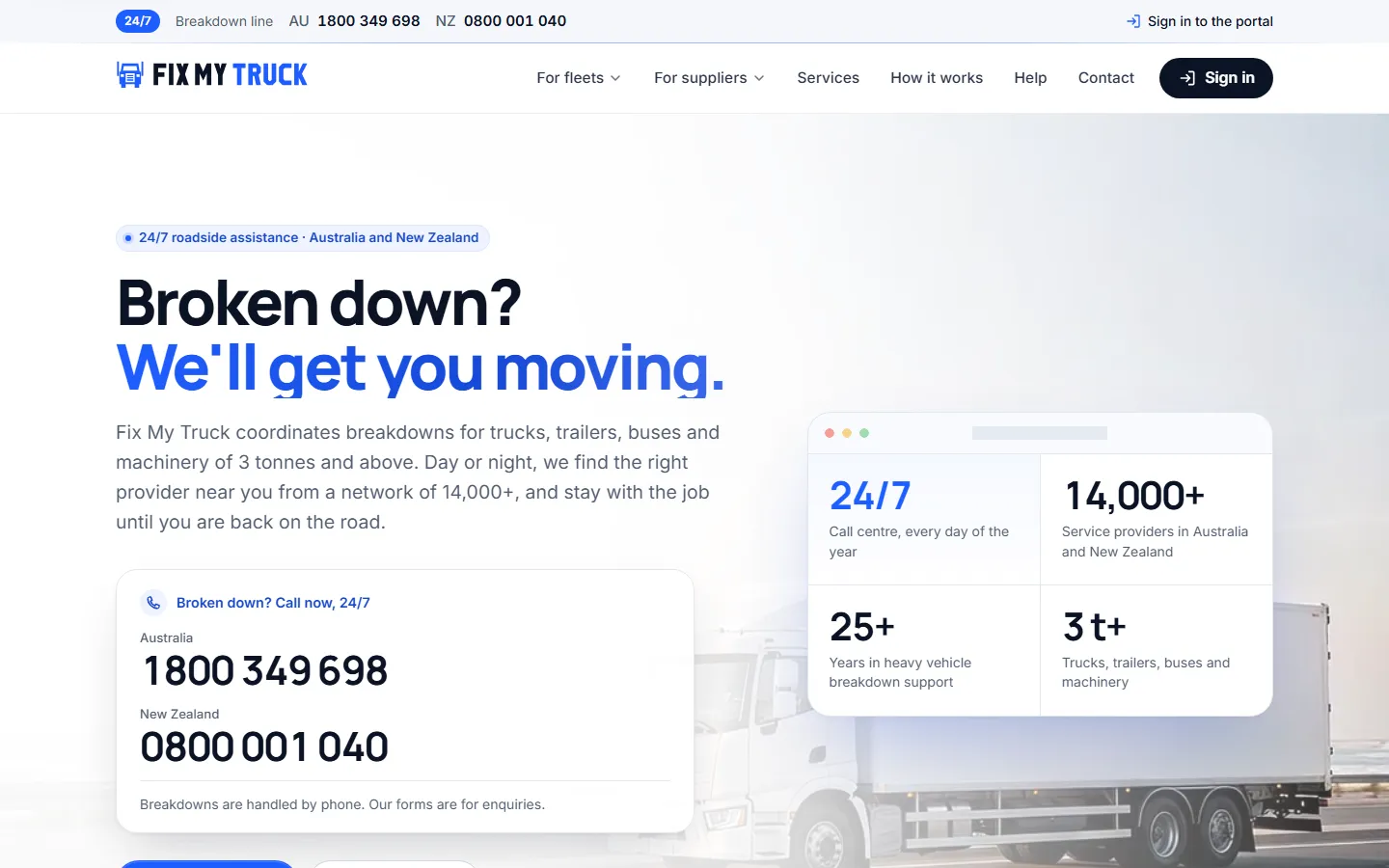
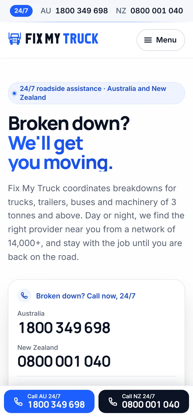
Design 02
Clean product
White, airy, one accent
Light and spacious, rounded cards and calm type: it reads as a technology company. Puts the portal and the online tools forward, for buyers comparing providers.
- Tone
- Calm, modern, product-led
- Photography
- Bright coastal highways, misty hills, a truck cab with the app on the dashboard
- Best for
- Fleet managers comparing providers; the portal and app as the selling point
Straight to: Home · Membership · For fleets · For suppliers · Help centre · Contact
Design 03
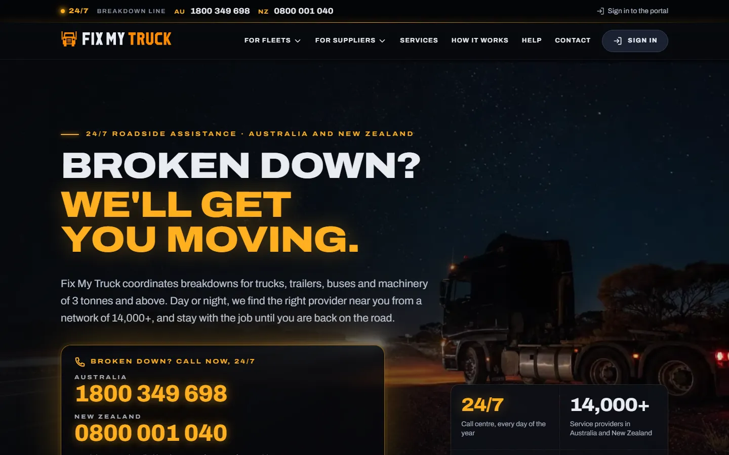
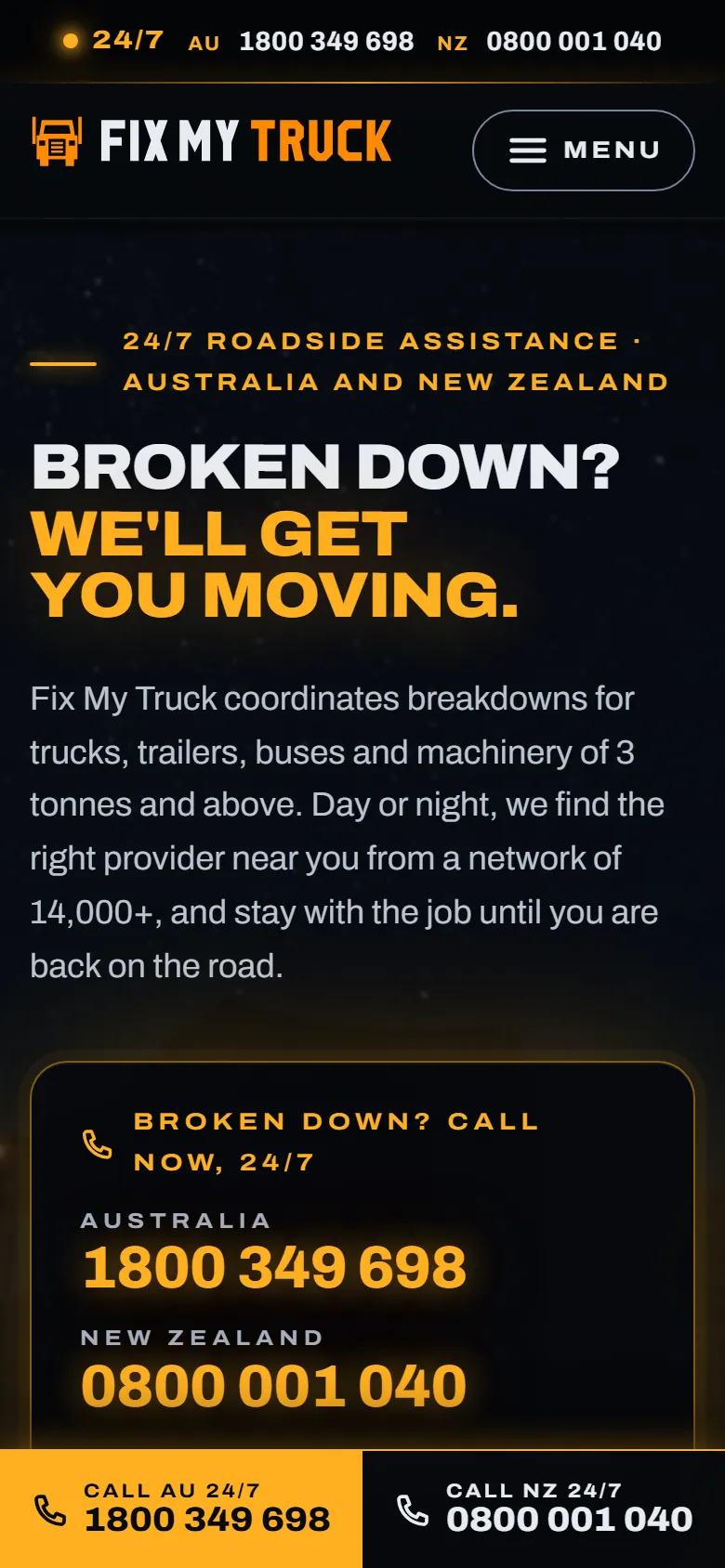
Night road
Dark, cinematic, hazard-light amber
A highway at night and amber hazard lights: emotional and memorable. Built around "you are never alone", for the moment someone has broken down.
- Tone
- Emotional, cinematic, reassuring
- Photography
- Outback highways at night, hazard lights, light trails; a looping clip behind the home page
- Best for
- A memorable brand; the moment someone has broken down
Straight to: Home · Membership · For fleets · For suppliers · Help centre · Contact
Design 04
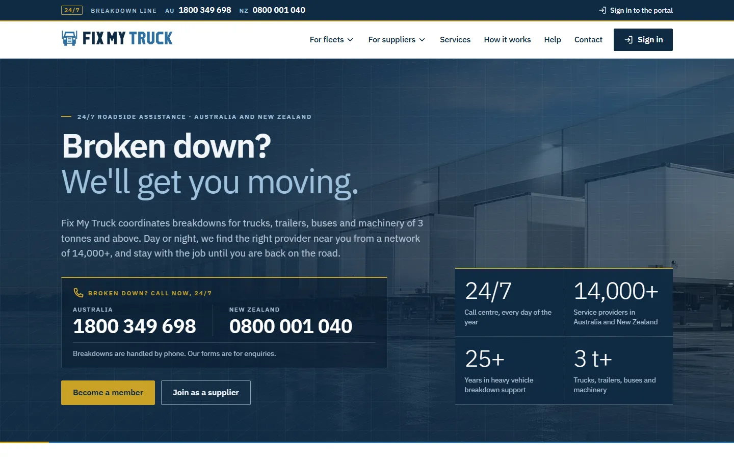
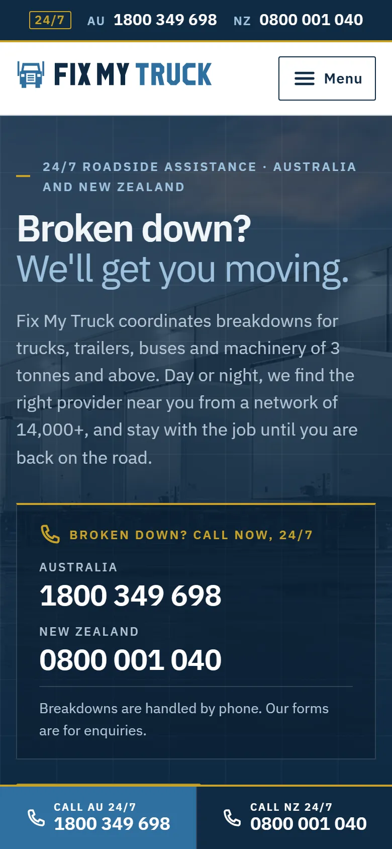
Corporate fleet
Steel blue and grey, data-led
Muted, precise and businesslike: figures, coverage and process up front. Speaks to large fleet operators and procurement teams.
- Tone
- Precise, businesslike, data-led
- Photography
- A distribution centre at dawn, motorway interchanges, an operations room
- Best for
- Large fleet operators and procurement teams
Straight to: Home · Membership · For fleets · For suppliers · Help centre · Contact
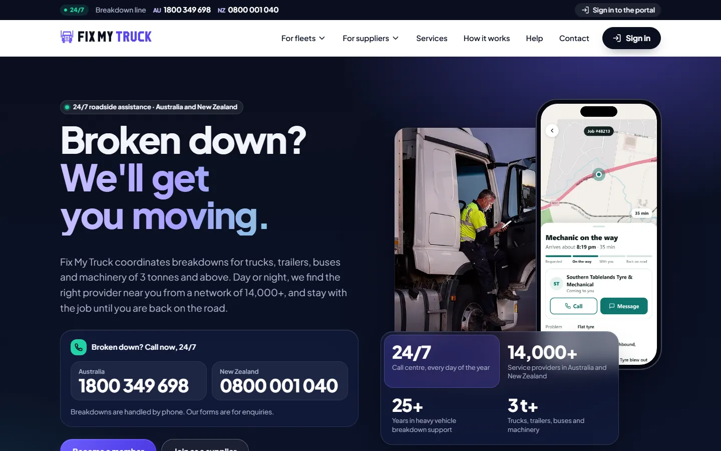
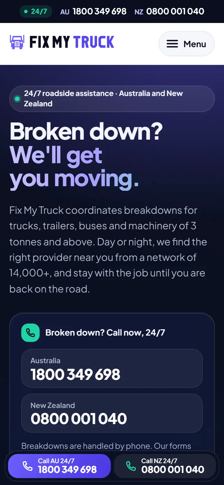
Design 05
App-first
The site looks and feels like the app
Leads with Roadie Mate™ and the portal: real app screens in phone frames, frosted panels and app-style cards. Says "we are the modern one", with "send the app to your drivers" as the main action.
- Tone
- Product-led, fresh, confident
- Photography
- Real Roadie Mate and portal screens in phone frames; a driver checking the app in the cab
- Best for
- Fleets choosing on technology; drivers who will use the app
Straight to: Home · Membership · For fleets · For suppliers · Help centre · Contact
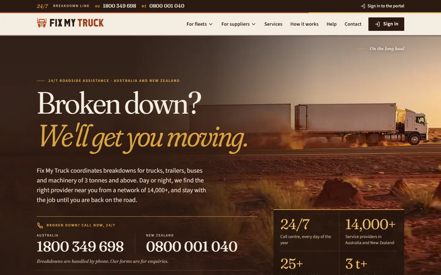
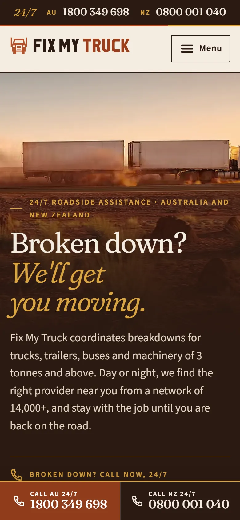
Design 06
Outback editorial
Red dirt, ochre and serif headlines
A magazine story about the people who keep trucks moving: warm earth colours, serif headlines, large documentary photographs. Distinctly Australian and premium, for a brand built on years of trust.
- Tone
- Warm, storytelling, premium
- Photography
- Documentary roadside work in the outback at golden hour, red dirt, road trains, a workshop
- Best for
- A premium, trusted brand; buyers who value experience and people
Straight to: Home · Membership · For fleets · For suppliers · Help centre · Contact
Side by side
| Design | Tone | Typefaces | Photography | Best for |
|---|---|---|---|---|
| Hi-vis industrial | Bold, practical, urgent | Barlow Condensed and Barlow | Daylight roadside work: a mechanic at a truck, a wheel change, the wheatbelt from above | Drivers and owner-operators who need help now; the trade |
| Clean product | Calm, modern, product-led | Manrope and Inter | Bright coastal highways, misty hills, a truck cab with the app on the dashboard | Fleet managers comparing providers; the portal and app as the selling point |
| Night road | Emotional, cinematic, reassuring | Archivo | Outback highways at night, hazard lights, light trails; a looping clip behind the home page | A memorable brand; the moment someone has broken down |
| Corporate fleet | Precise, businesslike, data-led | IBM Plex Sans | A distribution centre at dawn, motorway interchanges, an operations room | Large fleet operators and procurement teams |
| App-first | Product-led, fresh, confident | Plus Jakarta Sans | Real Roadie Mate and portal screens in phone frames; a driver checking the app in the cab | Fleets choosing on technology; drivers who will use the app |
| Outback editorial | Warm, storytelling, premium | Fraunces and Source Sans 3 | Documentary roadside work in the outback at golden hour, red dirt, road trains, a workshop | A premium, trusted brand; buyers who value experience and people |
The same in every design
The designs share one set of content and one build: a change to a page, a price or a guide appears in all of them at once.
- Every page, guide, price and FAQ: the content is written once and shown in each design
- The help centre's 27 guides for fleets, suppliers and drivers, with search
- Membership rates for Australia and New Zealand
- The contact, membership and supplier forms, connected to the Fix My Truck portal
- The breakdown numbers (1800 349 698 and 0800 001 040) one tap away on every page
- Fast, accessible and built for phones first
Mix and match
A design is a set of choices (colours, typefaces, photography, layout), so parts of one can be combined with another: the clean design with the night photography, the industrial design with the fleet typeface. Each design's photographs can also be replaced with your own.